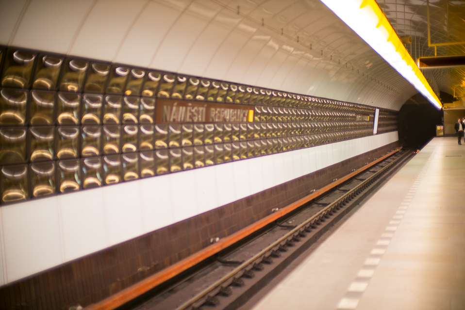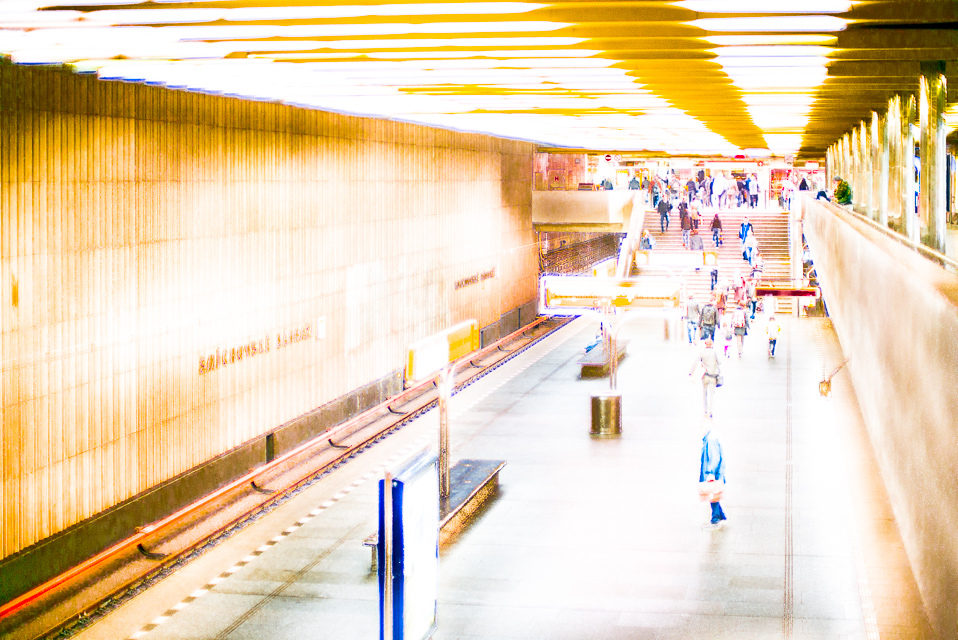
The Prague underground stations surprised this traveler with a common theme employed in their construction. The first impression is one of a blocky, soviet-style architecture and of course the inclination is to dismiss this as a somewhat inelegant, blocky, perhaps overdone, building style given the minimalist modes and elegant lines of modern construction. Looking more closely at the architecture, you realise this presumption is both ill-considered and, dare I admit, uncouth!
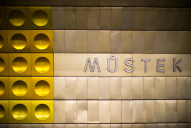
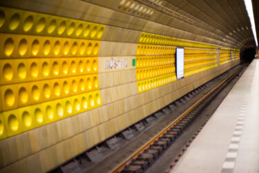
The different colour schemes of each station not only helps to differentiate one from the other, but adds interest and appeal (looks great!)
I grew to very much like and appreciate the overall design; it was not only functional, but with an aesthetic appeal that is charming, both for its functionality and the manner in which that is expressed in the construction.
The lack of advertising, the lack of brightly (or cooly muted b+w!) blazoned posters on walls and any space your eye is likely to wander, was a blessing; it is nice to see some public space just left to be. The simple platform guides efficient and useful.
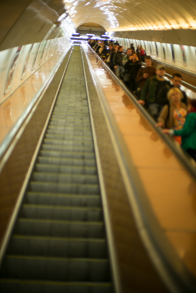
The escalators are quite looonnnggg!


